Let's count: There are one, two, three columns of new items to pick from, plus one on the right hand side with permanent items that someone who comes looking for news will disregard. This page asks your eyes to scroll in two dimensions, more or less simultaneously: Top-bottom and left-right. I don't know about your eyes, but mine don't want to.
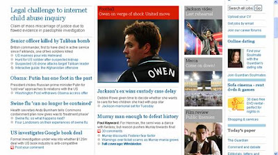
This task would be made a little easier if the various columns were horizontally aligned, but they're not. To see what I mean, consider this example from the Guardian football main page:

Here, the pictures towards the right hand side of the screen (e.g., "Friday's quiz") and the green lines to their left are aligned, so jumping back and forth between the columns is made a little easier. (By the way, I think that the alignment is purely by coincidence, but that doesn't matter for the sake of illustration.)
Can you do worse than that? Certainly! Here's how the world's leading newspaper presents itself on the web:

The first thing to notice is that this just looks plain shite in a cheap way. More importantly, this page gives us one column of permanent categories on the left and then four columns of regularly updated stuff: two columns of news and two "opinion" columns in the top right corner. What's more, the rightmost column is broken up into three subcolumns (if that's the right word) in the "Markets" box (below the picture of the watch). Pictures are sprayed across the screen in a chaotic fashion. Is it too much to say that this is an assault on the human brain?
When we scroll down, the New York Times treats us to this:

Almost incredibly, it seems nobody had the good sense to at least have the columns at the top of the screenshot (the ones with the photos) align with the ones at the bottom. And in those sections, it would have been easy, for example, to let the "Technology" and "U.S." columns start at the same height. Either you could simply (shock, horror!) leave some blank space or you could restrict the length of the various headlines/links (e.g., three headlines in each section, each of which is two rows long). Also note that the three icons in the left hand column all advertise services by the NYT itself, but the designs are pretty different, which adds to the nervousness of the page.
It's fitting that this is at the bottom of the page: It reminds me of people's basements.
Does it have to be that way? Nope. Here's Germany's most popular webpage, Spiegel Online:

First off, it must be noted that this page looks even a little less nervous than usual because most days there is large-scale (and usually very colourful) advertising in the right-hand space which is white in this screenshot. Even so, there is the exactly right number of columns presenting the major news which most visitors are interested in: one. This means that your eyes only have to navigate in the top-bottom direction. As an aside, it's another nice feature of this site that under the main news items (displayed at the top of the page, which this screenshot shows) there are links to a number of recent related articles for those looking for a little more depth on the issue. This changes further down when you simply get lists of news items in categories - in this shot gossip ("Panorama"), politics ("Politik") and sports (you've guessed it: "Sport"):

Almost a model of clarity, no?
As you may have guessed by now, I prefer Spiegel online's design to the NYT's. A more interesting question, though, is why the NYT presents such a chaotic page. Here are two interesting numbers: I counted 65 links on the first of the NYT screenshots reproduced above and only 14 in the first Spiegel Online reproduction (in both case counting two links to the same URL as one). One way of interpreting this is that the NYT page is made for people who are extremely adverse to scrolling down. A related one is that the page seems to be designed for attention markets in which people will leave your page if they don't find anything to their liking right away (without scrolling down). However, I submit that while the number of links noticed increases with the number of links displayed, the increase is not proportional. That should especially be a concern if your page looks as chaotic as the NYT's. In other words, I don't see an excuse for displaying the links in such a chaotic manner.
Something which is much harder to measure is whether the trashy look of their web pages - not newspapers' main sources of income - hurts the perception of the NYT and, to a lesser extent, the Guardian as quality newspapers.
Views, explanations? Comments on this post are especially welcome.
Related link: Back in 2004, Michael Blowhard had similar complaints about the design of magazines' tables of contents.
No comments:
Post a Comment